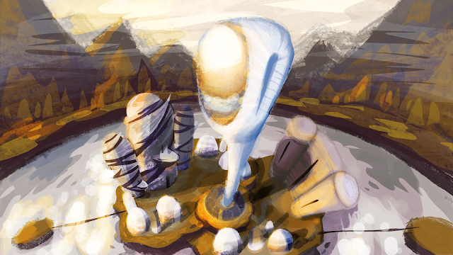
Vänlig Update @ Phil
I decided to add directional light to help with the tones. I added some texture to the buildings to help with the idea of fabrication. It was suggested that changing the colours of the buildings would help make them individually stand out, though i wanted keep it similar since my artists work is more for texture and material and since Vanlig is a city of unity and equality it's only fair that the colours are also equal and only the texture should differentiate.

Hi Megan. I think you could possibly ramp up the shadows to really make the buildings stand out, some of the shadows on the smaller dome like buildings could be tweaked as they tilt more to the left compared to the more prominent shadows of the larger buildings. That centre building with a more prominent shadow would really show its grandeur and scale you could maybe even show some atmospheric perspective with it by blending it in with the sky a tad to really try and show its scale :)
ReplyDeleteThank you for the feedback! I'll definitely try that!
DeleteHey Meg - I think all the changes implemented here are really working and the 'golden light' is a lovely addition. I can't quite read the fabrication of the dark wrapping around the the building on the left of the observatory - is it 3D or extruded, or is it flat and patterned?
ReplyDelete