Animator Review
Lotte Reiniger
 |
| Fig.1 |
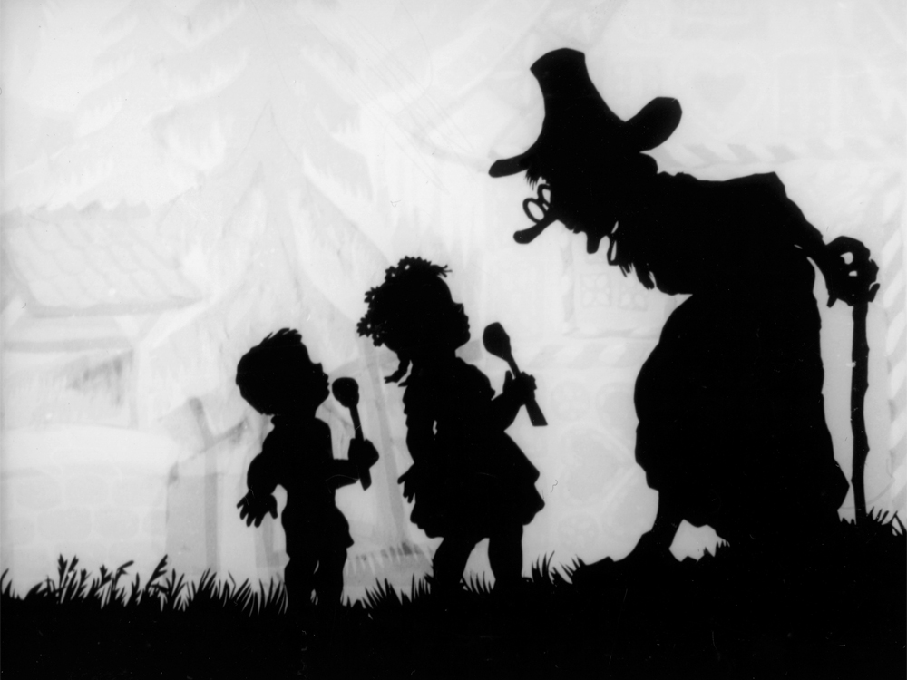
Her process is carried out by designing the characters onto black card, each part of the character such as the torso, head, forearm and anything being animated is cut separately from each other, in other terms the more parts separated the more options you have when it comes to moving the character during the process of animating. To connect these parts together, areas are pierced so that they will be connected and support the role of moving the character around. Then, "metal" hinges are used to keep the parts connected and movable, creating the full body of the character and the ability to function it's poses.
 |
| Fig.2 |
During the process of animating, The scene is set up by a light box, any background details is placed on top of this and a glass plate is then placed on top of that where the character and the foreground details will also be placed. It's sort of a traditional way of "Locking" Layers, you don't want to move the background during animating so using a glass plate to hold it down makes it less fiddly. Finally, with a lot of patience movement is created each time a photo is taken above, its a process of moving the character and taking the photo each time and becomes repetetive.
Overall, Lotte's style of animation is painfully charming, her characterisation in silhouette animating makes it easy so identify characters, she animates on a flat perspective and yet, she is still able to make her characters actions effective. Her style of animation shows how a simple technique can have a huge affect when it comes to narrative animating.
Don Hertzfeldt
 |
| Fig 3 |
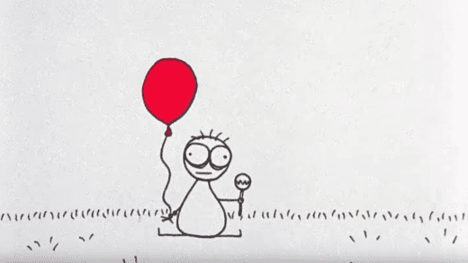
One thing to admire about one of his animations Billy's Balloon is the innocent yet still quite violent actions going on, though it's made to seem quite light since the balloon attacking billy is not so harmful so you hear these rubbery sounds when billy is hit by the balloon making it seem more comedic while still being very violent. The entirety of the animation itself doesnt have much context apart from balloons beating up children but i think that's what Hertzfeldt communicates that, through the simplicity of style and vague context you can still make an effective animation
Illustration:
Fig 1 [Screenshot] : http://www.bfi.org.uk/education-research/education/gothic-classroom/hansel-gretel-1955
Fig 2 [Screenshot] : https://www.youtube.com/watch?v=LvU55CUw5Ck @ 4:00
Fig 3 [Screenshot] : https://www.directorslibrary.com/director/don-hertzfeldt/
Bibliography:
Hutchinson, 2016 - https://www.theguardian.com/film/2016/jun/02/lotte-reiniger-the-pioneer-of-silhouette-animation-google-doodle [Accessed Oct. 12 2017]
Jenkins 2013 - https://www.theguardian.com/film/filmblog/2013/may/02/don-hertzfeldt-animator-beautiful-day [Accessed Oct. 12 2017]
Comments
Post a Comment